
Client
Algiz
The Role
Brand & Visual Identity Design, Product/UX Design (full redesign of an existing identity for a real client)
Overview
The Problem
The original identity carried the right subject matter but not its weight — mythology, ritual, and memory need to feel felt, not just illustrated. The brand didn't yet hold that tension.
The Intention
To rebuild the identity around a single, quiet symbol — the Algiz rune - and let it carry meaning without becoming a costume. Protection, memory, and belief, translated into something timeless rather than decorative.
The Result
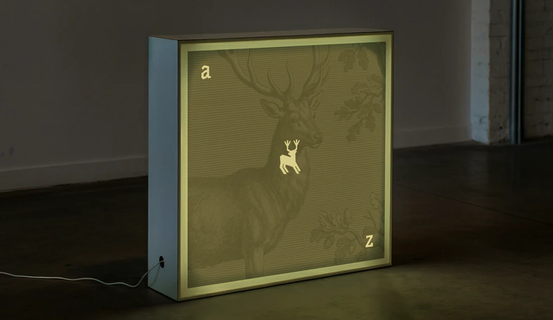
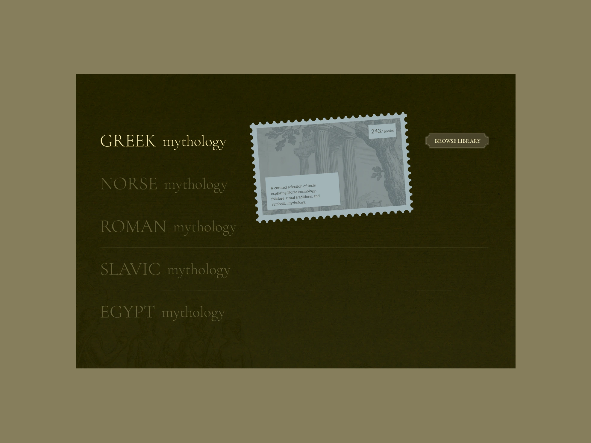
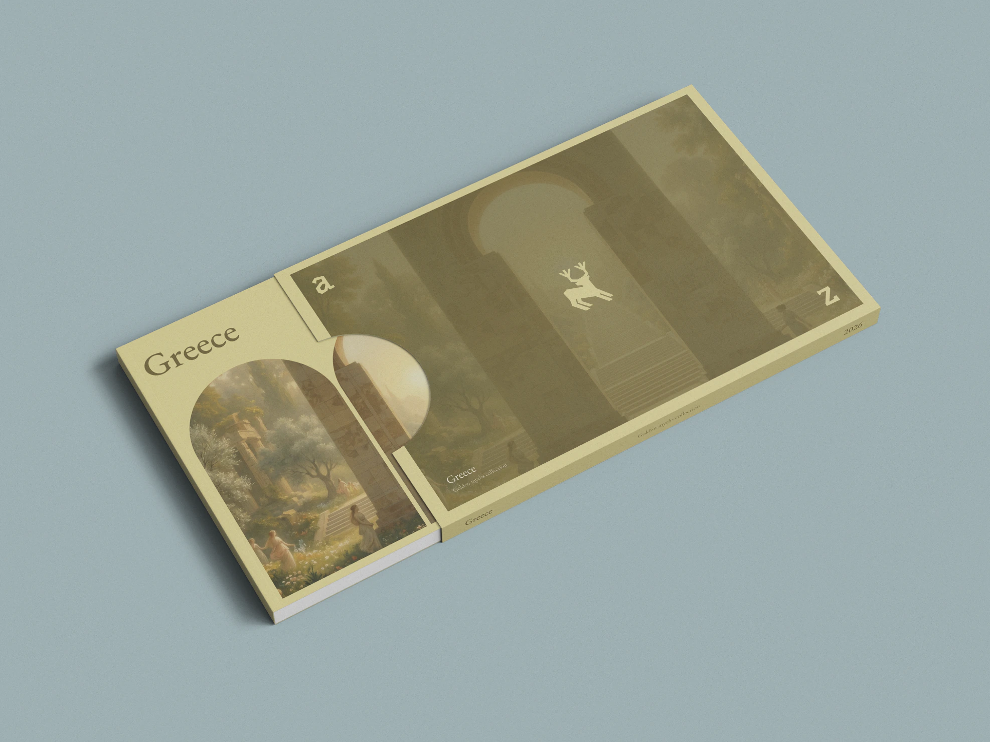
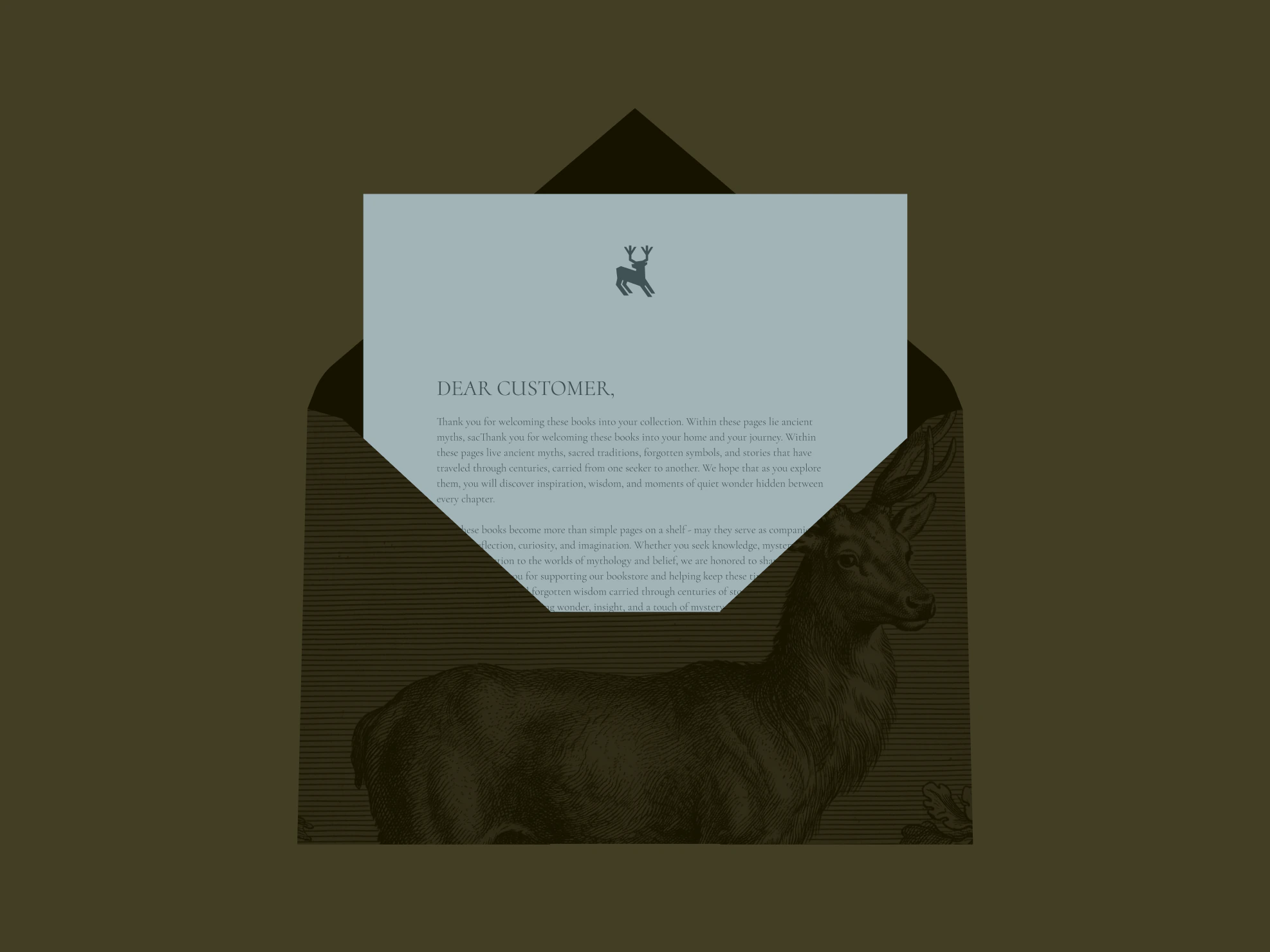
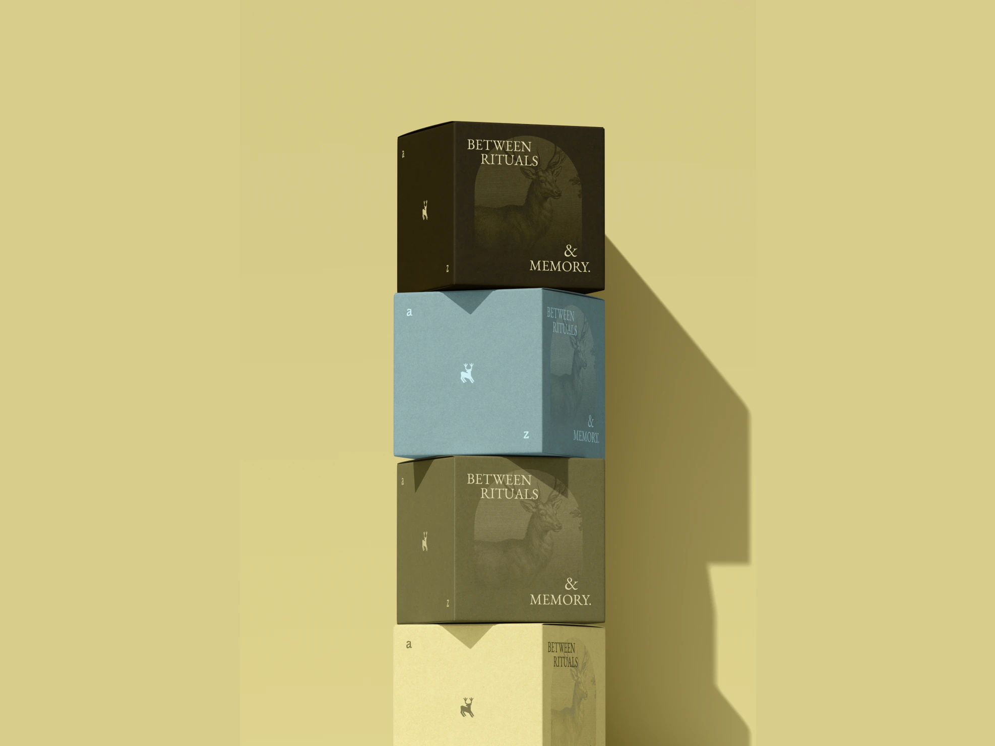
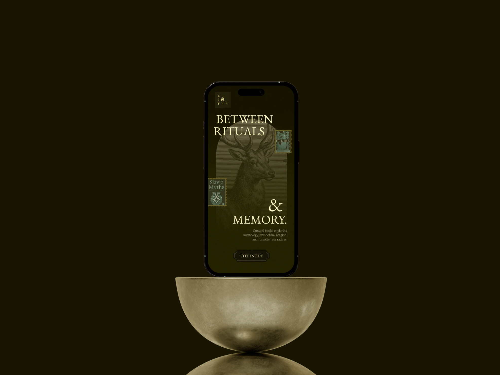
A complete visual system built around the Algiz mark — packaging, a curated book collection identity, and a library structure spanning five mythologies, redesigned from an earlier version of the brand.
The
history
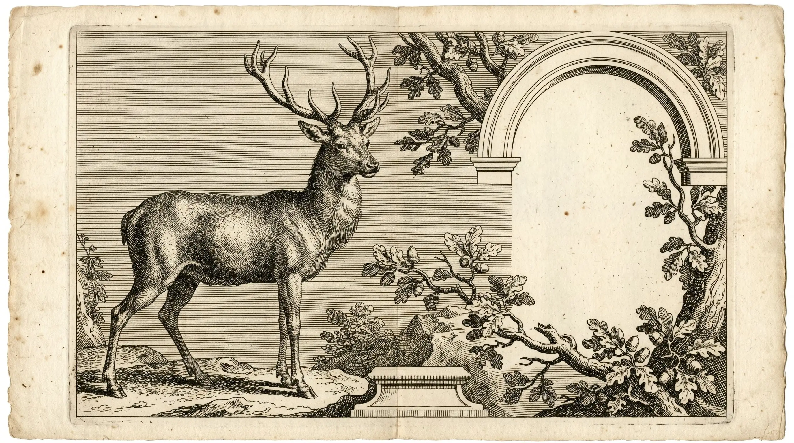
How do you design a visual identity inspired by sacred symbolism without falling into cliché? The real challenge was the Algiz rune itself — turning it from a direct symbolic reference into something quieter, more timeless, and emotionally suggestive.
Not every thought needs a plan. Some just need a place to land
- and someone (or something)
quiet enough to notice when
it means something.
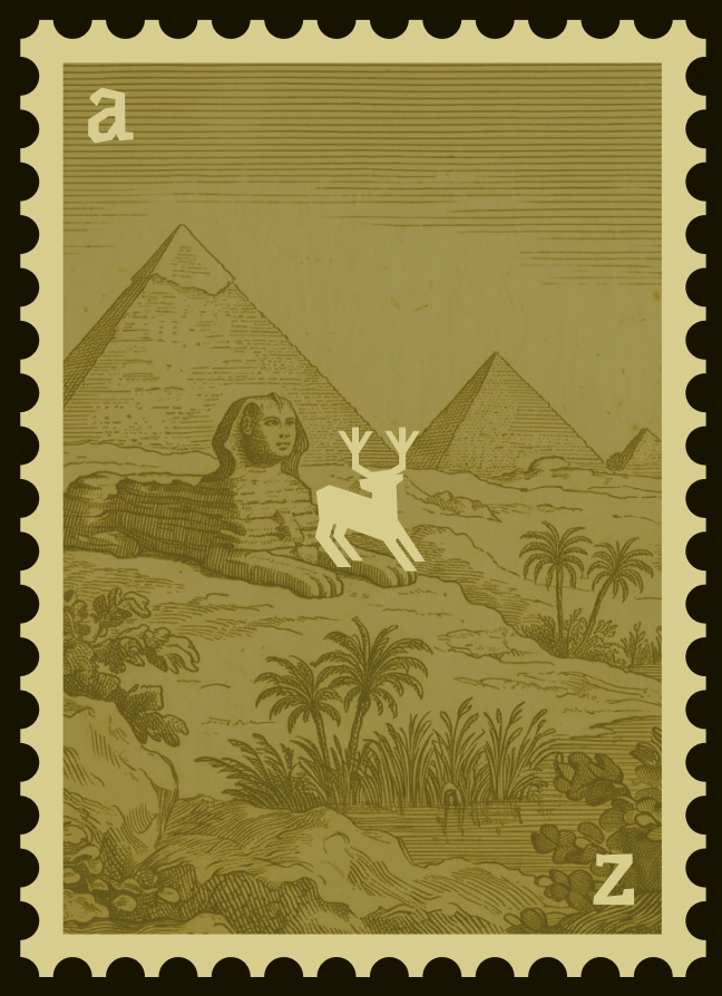
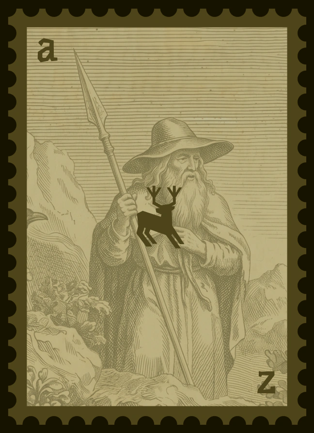
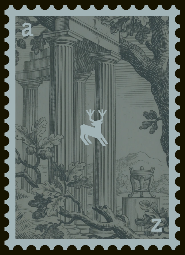
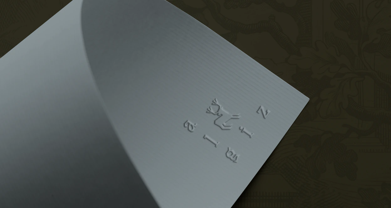

Long before history was written down, myth carried it — passed through rituals, symbols, and stories told around a fire to keep the unexplainable from being forgotten.
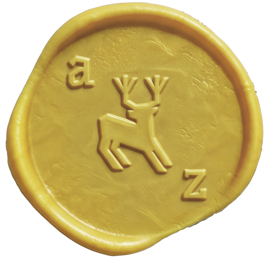
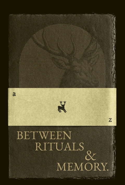
Every mythology is an attempt to remember.
This project reflects a return — reworking an earlier identity into something that finally holds the weight of what it represents: not decoration, but memory made visible.
