Client
UAPP
The Role
Brand identity
Overview
The Problem
UAPP needed a visual identity that could communicate the depth of psychotherapy without relying on the familiar clinical aesthetics of the field.
The Intention
Instead of visualising therapy through its terminology, I focused on what happens at its core: attention, dialogue and human connection.
The Result
A warm, restrained identity built around listening — with a visual language that feels thoughtful, human and quietly expressive.

Listening
beyond
words.
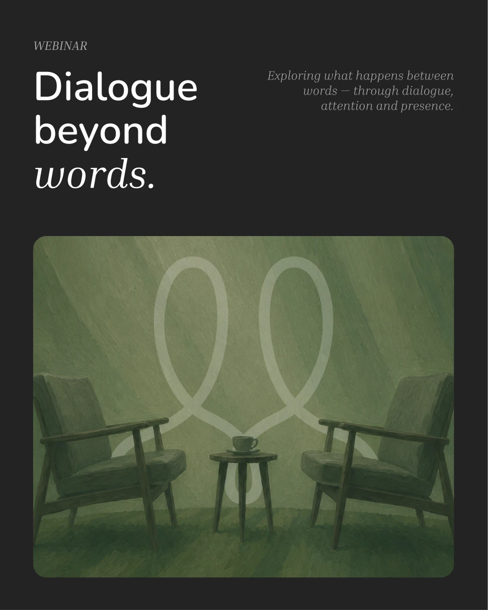
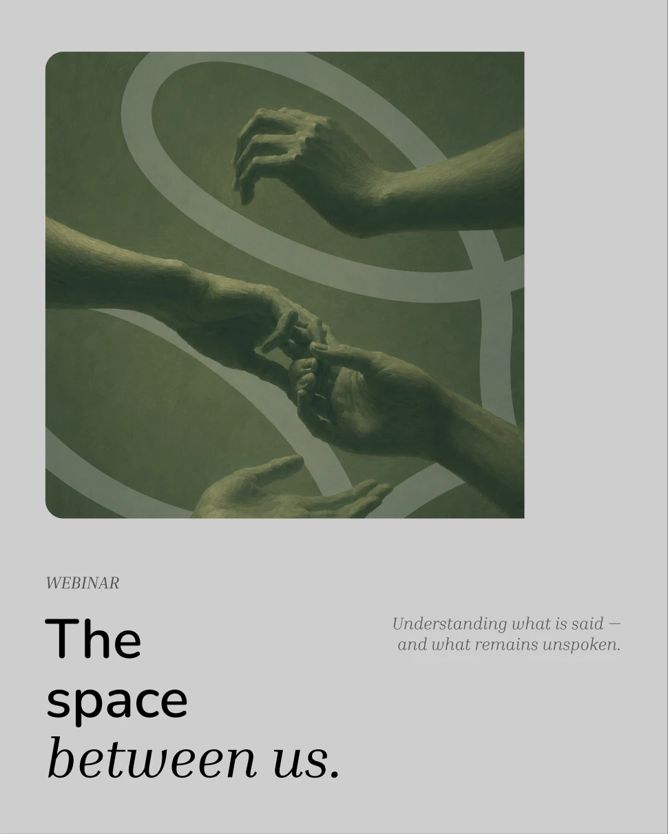
Psychotherapy begins with listening. But meaningful listening extends beyond what is spoken. A pause, a gesture, a change in expression - sometimes the most important part of a conversation exists between the words.




Three ideas. One identity.
The UAPP logo brings together
Ukrainian identity, people and connection.



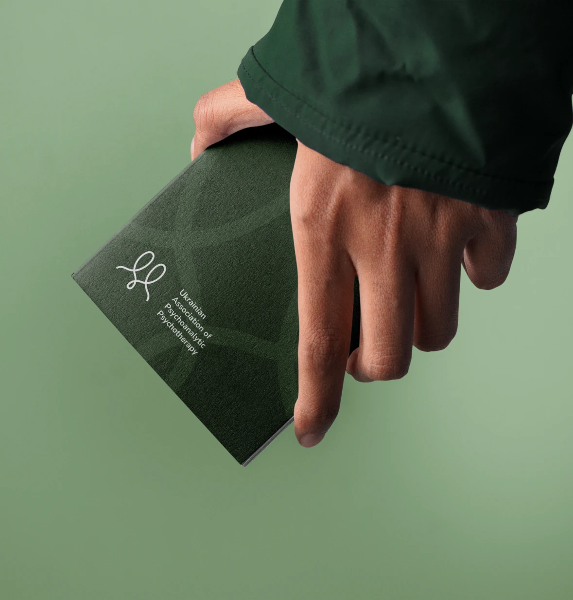
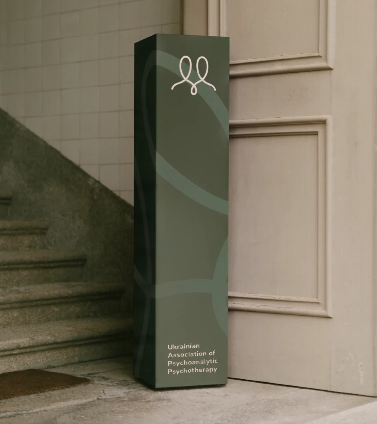



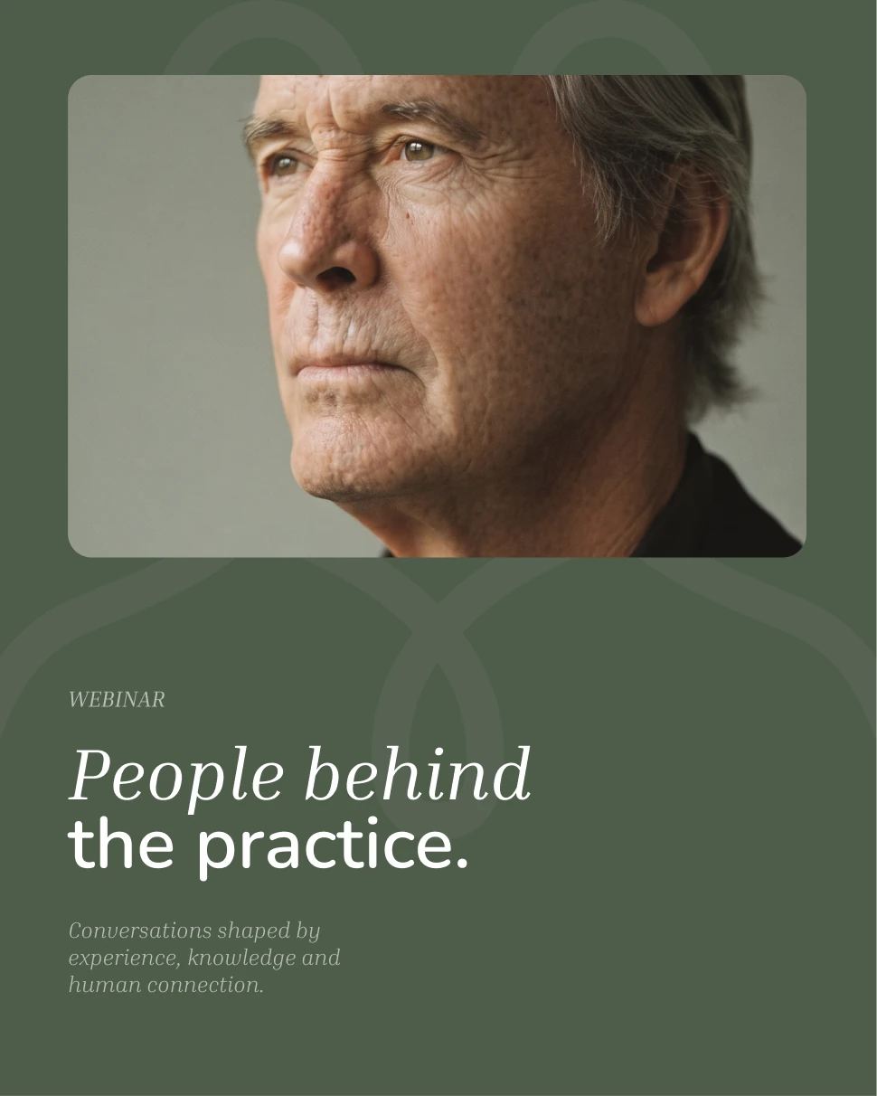
The visual identity becomes an environment for conversation - from the first announcement to the moment the audience enters the discussion.
A visual identity built around listening. UAPP is not only about what is said. It is about creating the space to notice, understand and stay present - even when words are not enough.